
A platform designed to enhance user engagement through interactive features to create an intuitive and engaging user experience that reduces dropout rates and motivates continuous learning.
Client
Ageovisa
Tools
Figma, Photoshop, Protopie
Skills
Interactive Design, Content Design, Information Architecture
"One size does not fit all." — Frank Zappa
Context
Drawing from my trilingual background, I designed a language learning app to address overly complex user flows provided by stakeholders. As the sole UX Designer, I was responsible for communicating with stakeholders (who served as PM roles), owning the entire design system and prototype, and improving usability through user research, competitive analysis, wireframing, prototyping, and testing. With 13% of U.S. adults (~33.8 million) currently using language learning apps, this project achieved a 40% increase in user satisfaction, potentially adding 13.52 million positive experiences annually and raising the total to 47.32 million.
Problem
Preexisting design confused users due to its complicated interface.
Unclear navigation pathways required multiple steps to access key features, while categories and content were not organized intuitively.
Hindered the learning process and made user flow unnecessarily difficult.
Vision
Design a mobile application with user-friendly interface. Simplify and streamline user flow by reducing unnecessary steps and clarifying navigation. Enhance language learning through personalized progress tracking and adaptive features.
Final Design Preview
Design Process
Discovery
Conducted user interviews with 10 participants to understand pain points in language learning apps, focusing on engagement and goal-setting.
Users struggled to maintain consistency mainly because of busy schedules and other life stressors.
Difficulty keeping motivation due to lack of personalized feedback or adaptive learning paths.
Ideation
Replaced the prior desktop version and its initial diamond diagram concept, which users found too confusing, with a streamlined mobile-first design.
Created wireframes and iterated based on user feedback to simplify navigation and optimize the user flow.
Validation
Tested the high-fidelity prototype with 10 users to assess usability and overall satisfaction.
Simplifying the app’s structure led to a 30% improvement in task success rate and contributed to higher retention rates.
Introduced a mixed-learning model (kinesthetic, audio and visual), which increased learner satisfaction by 40%.
Enhanced progress tracking features were well-received, driving a 25% increase in app engagement.
Research
Platform
Mobile learning apps offer greater engagement and completion rates compared to desktop platforms due to ease of access
Usability testing resulted in 72% of users preferring mobile app
Learning
Incorporation of multiple learning style — audio, visual, and kinesthetic — to create a more engaging, personalized learning experience
Increase in retention rates: reading +10%, visual +20%, experiential +75%

Insights Into Learning Preferences
App Features
Suggested courses by level and interest
Search and filter courses based on topics of interest
Interactive kinesthetic, audio and visual learning styles
Optional intake quiz to personalize learning recommendations
Progress tracking (streaks, stats) for ongoing motivation and improvement
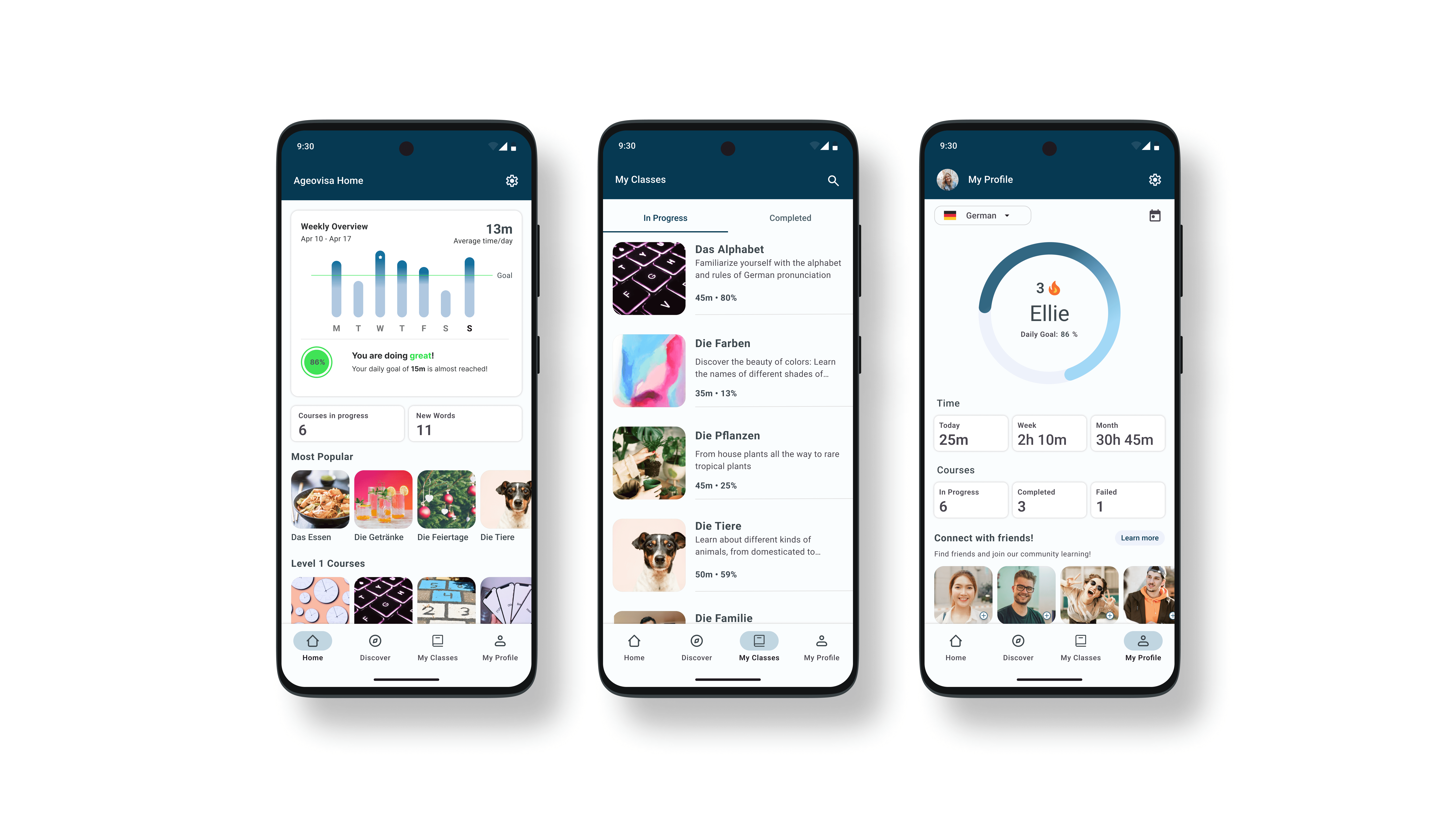
Feature #1: Home, Discover, Classes, Profile - Navigation
Users require easy, intuitive access to learning materials and their progress.
I implemented a bottom navigation bar for clear and straightforward access to the home page, discovery options, current classes, and the user profile. This decision was backed by usability tests that showed higher task completion rates compared to more complex navigation schemes.
I initially played with a diamond-shaped sitemap (as proposed by the founder), but after further testing, the bottom navigation was more intuitive and consistent with mobile app best practices.
Exploration
App needed to include a way to locate: Classes offered, classes in progress, classes completed
Iterations of My Classes Tab
After conducting A/B testing, I selected Version C, which integrates key elements from both Versions A and B to enhance user flow. Leveraging the navigation bar, I created a dedicated "Discover" page where users can explore available classes, equipped with a detailed search and filter function for streamlined access. Additionally, I designed the "My Classes" page with a straightforward layout, featuring tabs that allow users to easily switch between classes in progress and completed classes. This approach aims to optimize usability and improve overall user engagement.
Final Design of My Classes Prototype
Feature #2: Content Organization
I designed two main tabs to organize learning materials and personalize the user experience. Each tab serves a specific purpose, making it easier for users to discover new topics and manage their learning journey.
Discover tab: Used to search any topics of interest, paired with app suggestions of most popular, similar topics, and filter options.
My Classes tab: Bookkeeping of all the courses that are in progress or completed.
How to Find Content Prototype
Feature #3: Chatbot Learning Style Quiz
Knowing one’s learning style is crucial because it helps tailor learning strategies to maximize understanding, retention, and engagement.
Results of my user surveys:
80% faced academic struggles due to the one-size-fits-all approach education
70% of users were unable identify their optimal learning style.
65% of users expressed frustration with static questionnaires.
I explored multiple options — chatbot, quiz, and questionnaire — but found that the chatbot was most engaging and user friendly. It guides users through determining their best learning approach. By walking users through the process interactively, they gained more clarity on how they learn, which led to more productive learning sessions.
Chatbot Prototype
Feature #4: Interactive Learning experience
Initial suggested course content proved to be narrow-minded and limiting to user's desires of learning outside of the box.
Courses are structured with a mix of audio and visual learning elements, complemented by progress trackers and dynamic tests. Users can interact with fill-in-the-blank exercises, puzzles, and multiple-choice questions.
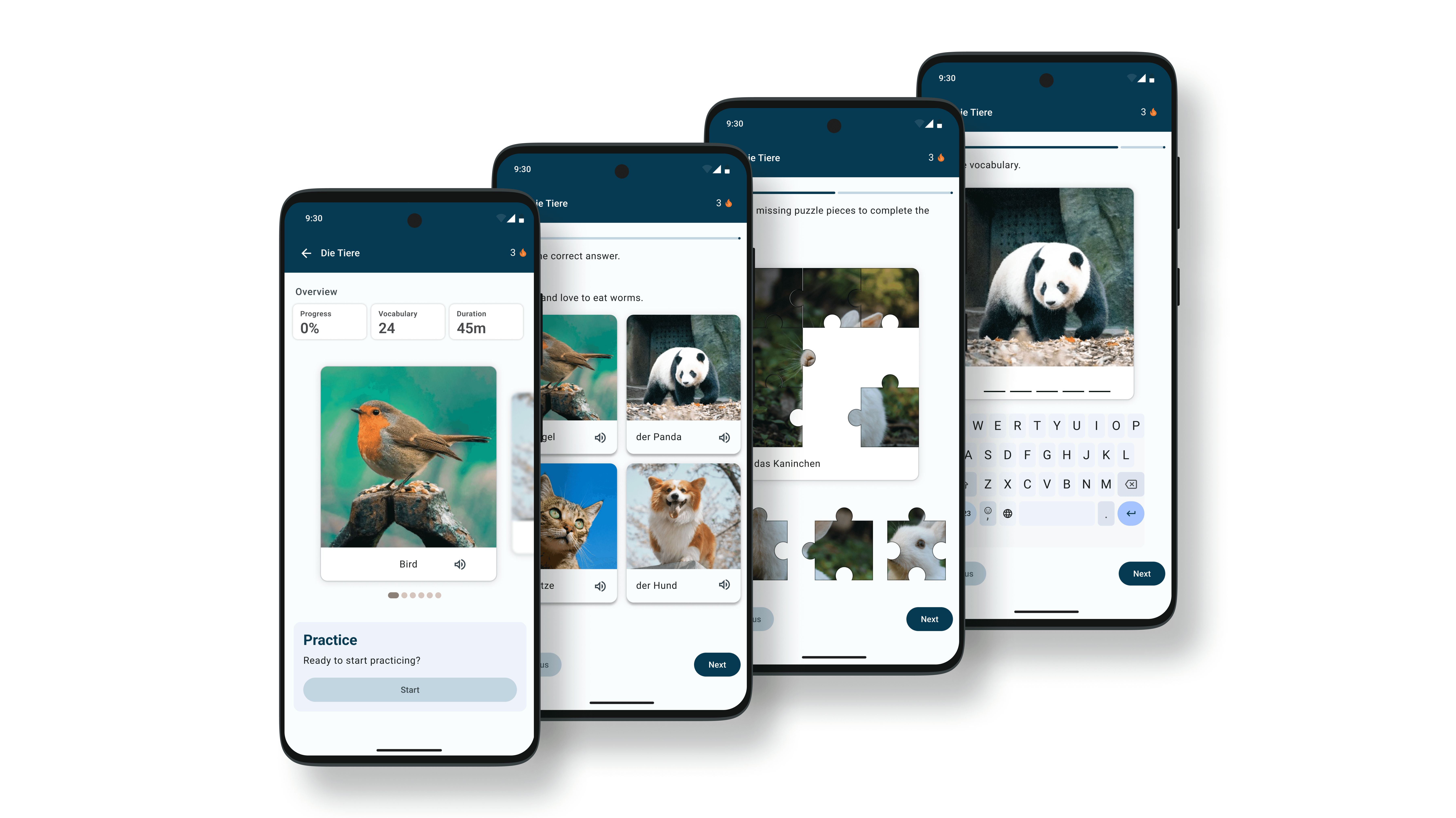
Different Interactive Learning Methods
Feature #5: My Profile
Research concluded that one of the major causes of unsuccessful language app learning is due to lack of motivation.
The profile page tracks user progress with streaks and visual graphs to motivate continuous learning. Users are more likely to return to the app if they could track streaks and have a sense of community, which wer the most effective motivation factors according to a study on gamification.
My Profile Prototype
Results
Simplifying the app's structure resulted in a 30% improvement in task success rate and significantly boosted user retention. The introduction of the mixed-learning model increased learner satisfaction by 40%. Additionally, progress tracking features led to a 25% increase in overall app engagement, demonstrating the effectiveness of the design changes in meeting user, as well as stakeholder's needs.
Next Steps
Future development will build on insights from the design process, which revealed the importance of personalization and community in maintaining user engagement. Moving forward, the focus will be on developing a community feature to enhance collaboration, integrating more language options to broaden accessibility, and implementing AI-driven suggestions to personalize the learning experience further.
Learnings
Utilized pen and paper to structure initial ideas and establish the project framework.
Emphasized the importance of flexibility, with discarded ideas leading to improved solutions.
Realized the need to keep files organized from the beginning to streamline workflow and prevent confusion.
Identified the benefit of taking intentional breaks, especially when feeling stuck or unproductive, dedicating more time to brainstorming and seeking inspiration beyond the computer screen.

